Martoo

Visual Identity Guidelines

Martoo is a Dubai-based online grocery platform founded in 2020, offering a wide range of fresh produce, pantry staples, and household essentials. With a focus on quality and convenience, it serves both individual shoppers and businesses through its B2C and B2B channels

Summary

Martoo was created to bring the market experience online. The brand exists to make fresh food feel reliable, friendly, and easy to access, turning everyday grocery purchases into a consistent, trust-driven experience rather than a chore.

Client:

Martoo Online Market LLC

Duration:

4 Weeks

Project Status:

Published

Industry:

Ecommerce, Grocery

My Role:

I led Martoo’s brand identity development, shaping its visual system, logo language, and color palette to communicate freshness, approachability, and trust across packaging, print, and digital touchpoints.

The Team

1 Brand Designer 1 Brand Strategist 1 Visual Designer 1 Content Lead

Tools Used

Let’s Connect

Some Questions Left Unanswered? Let’s Talk One-on-One! You can either book a session or send me an email at akankush92@icloud.com for any additional questions or clarifications. ​ Looking forward to connecting and discussing further with you!

01 Strategy

The strategy focused on positioning Martoo as a friendly yet reliable daily companion for fresh groceries. By combining bold visual signals, simple messaging, and a consistent system across physical and digital touchpoints, the brand differentiates itself through clarity, speed, and emotional warmth in a competitive online grocery space.

Mission

Martoo’s mission is to help people eat better by making fresh, organic food easy to discover and fast to receive. The brand is committed to quality sourcing, dependable delivery, and building long-term trust with customers through consistency and care at every interaction.

Brand Idea

Martoo bridges the gap between traditional local markets and modern digital convenience. The idea centers on translating the familiarity, warmth, and abundance of a physical market into a clean, intuitive online experience that feels human, dependable, and refreshingly simple.

Our Values

Martoo is built on honesty, freshness, and reliability. Every decision reflects a commitment to quality ingredients, transparent service, and a customer-first mindset that values long-term relationships over short-term gains.

03 Typography

Martoo’s typography system is clean, modern, and highly legible. It balances friendliness with structure, ensuring clarity across screens, packaging, and print while supporting the brand’s approachable and dependable personality.

Font

Galano Grotesque was chosen for its contemporary proportions, strong readability, and geometric warmth. The typeface supports Martoo’s bold yet friendly tone, performing consistently across digital interfaces and physical applications while reinforcing brand confidence.

Weights & Styles

A controlled range of weights creates hierarchy and clarity. Semi Bold is used for emphasis and headlines, Medium for subheads, and Regular for body copy, ensuring balance and readability across all brand materials.

Typeface Settings

Careful control of kerning and tracking ensures clarity and consistency, particularly at smaller sizes and on screens where readability is critical.

Usage Chart

The following tables define recommended typographic settings for screen and print applications, ensuring consistency, readability, and visual harmony across all brand touchpoints.

Usage Chart

Size Line-height Kerning Tracking
10px 14px Metrics 0
12px 16px Metrics 0.2
14px 20px Metrics 0.4
16px 24px Metrics 0.6

Usage Chart

Size Line-height Kerning Tracking
18px 26px Metrics 0.8
20px 30px Metrics 1
24px 34px Metrics 1.2
32px 42px Metrics 1.4

Usage Chart

Size Line-height Kerning Tracking
9pt 13pt Metrics 0
11pt 16pt Metrics 0.2
14pt 20pt Metrics 0.4
18pt 26pt Metrics 0.6

04 Colors

Martoo’s color palette is inspired by freshness and produce-driven energy. Bold reds create appetite appeal, balanced by clean neutrals and deep blue accents that add trust, contrast, and visual stability.

The Basics

The palette combines vibrant primary tones with supportive neutrals to ensure flexibility across packaging, digital, and environmental applications.

HEX

A hexadecimal way of representing the red, green and blue of screen colors.

RGB

Red, green and blue, the component colors which create all screen colors.

CMYK

Cyan, magenta, yellow and black. The four colors used in offset and digital printing.

PMS

Pantone Matching System: Global color numbering for precise color selection and matching.

OKLCH

OKLCH stands for Optimal Color, Lightness, Chroma, and Hue and is a color model designed to be more perceptually uniform.

Please Note

Various factors can affect color reproduction. Prior to large-scale print runs, it's advisable to conduct testing.

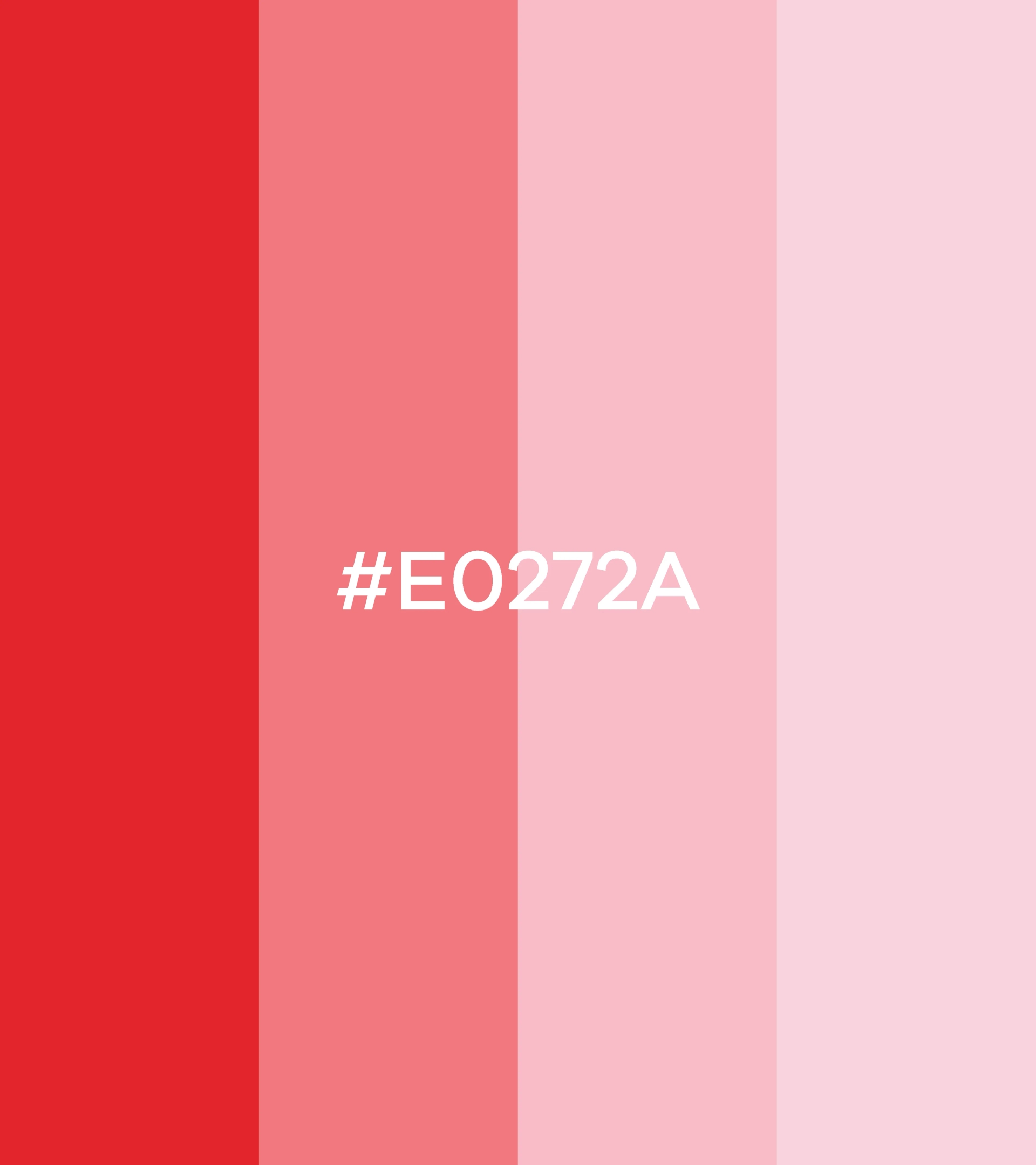
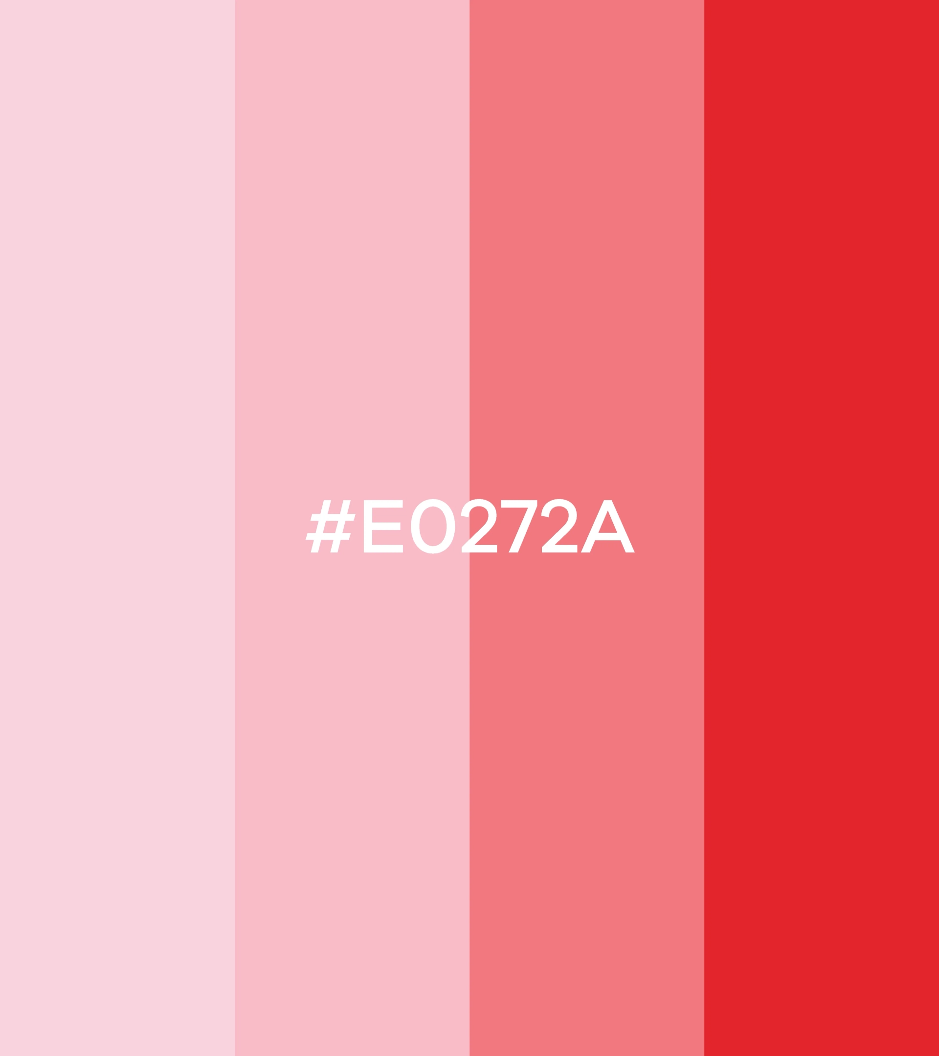
Primary Accents & Tones

Copy Hex
HEX: #e0272a
Copy Hex
HEX: #fa777e
Copy Hex
HEX: #ffbcc6
Copy Hex
HEX: #f7d2d9

Secondary Accents & Tones

Copy Hex
HEX: #162946
Copy Hex
HEX: #27436e
Copy Hex
HEX: #3e5f95
Copy Hex
HEX: #5c7fb8

Secondary Accents & Tones

Copy Hex
HEX: #000000
Copy Hex
HEX: #555555
Copy Hex
HEX: #aaaaaa
Copy Hex
HEX: #ffffff

05 Images

Martoo imagery focuses on freshness, real products, and everyday moments, reinforcing trust and authenticity through clean compositions and natural lighting.

Style

The visual style is bold, minimal, and product-forward. It prioritizes clarity, consistency, and warmth across all applications.
Fresh Produce Focus:
Imagery highlights real fruits and vegetables to reinforce quality.
Clean Backgrounds:
Neutral backdrops keep attention on the product.
Bold Branding:
Strong color blocks and logo presence drive recognition.
Human Touch:
Lifestyle moments add warmth and relatability.

Packaging & Branding in Context

Packaging translates Martoo’s digital identity into physical form, ensuring consistency and instant recognition during delivery and unboxing.

Stationary and Print

Print materials maintain a clean hierarchy, reinforcing professionalism and trust through restrained layouts and consistent branding.

Digital and UI

The digital system prioritizes clarity, speed, and ease of navigation, supporting a smooth online shopping experience.

Retail and Environmental

Environmental branding applies the identity at scale, maintaining visibility and coherence across signage and physical touchpoints.

06 Brand Pattern & Iconography

Martoo’s iconography and brand pattern system is simple and friendly, designed to support navigation while reinforcing brand personality.

Monogram

The monogram is derived from the smile element of the logo, acting as a compact brand marker. It is used in small-scale applications where full logo visibility is limited, maintaining recognition and consistency.

Iconography

The monogram is derived from the smile element of the logo, acting as a compact brand marker. It is used in small-scale applications where full logo visibility is limited, maintaining recognition and consistency.

Patterns

Patterns are created using repeated logo elements and line motifs. They add texture and depth while maintaining subtlety and avoiding visual clutter.

07 Impact and Testimonials

Post-launch performance shows strong brand recognition and customer trust. The refreshed identity improved clarity, consistency, and emotional connection across both digital and physical experiences.

Measuring Martoo’s impact

Testimonials

Customer feedback highlights Martoo’s clarity, freshness, and reliability. Consistent branding and service have helped build emotional trust and everyday relevance across diverse customer segments.